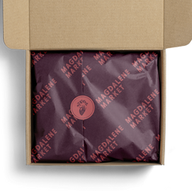
Magdalene Market
LOGO DESIGN
Year: 2021
Role: Lead Designer

Magdalene Market is the passion project of a close friend. Corinne hand-etches glass, designs jewelry, and creates wood-burned pieces around her Christian faith. As a designer, I was inspired by the careful, handmade quality of her work. As a client, she wanted elements of the logo to have meaning, much like the iconography that shows up in her work. This project showcases a logo system that is both practical in its flexibility and meaningful in the attention to detail–but above all highlights a collaboration.

PRIMARY LOGO
SECONDARY LOGO & COLORS

DESIGNER INTENTION
in my words

1
SHAPE
The shape of the logo was drawn from arches and stained glass images, architecture that inspires Corinne's work.
2
TEXTURE
I was struck by the texture of Corinne's glass etchings. I set to work incorporating the overlapping, engraved lines into the logo.
3
MEANING
The hand gesture was studied from medieval portraits and centers the iconographic focus of the brand. The flower is close to Corinne's heart and mimics the shape of the arch.
1
CLIENT REVIEW
in her words


